enJOY it

an archived personal and craft blog from Elise Blaha Cripe.

Newbloglook

So I said I was going to get a blog design together in the next few weeks. And then I said early next week. And then I said by Thursday for sure. And then last night I was like "Welp, I can toss and turn in bed and think about HTML, or I can just sit at my computer and HTML it out."

This is how it is when I get ready for a new blog layout. It's like a hot mess of not being able to sleep, sweaty palms and tension headaches. But then it's done and life is good again.

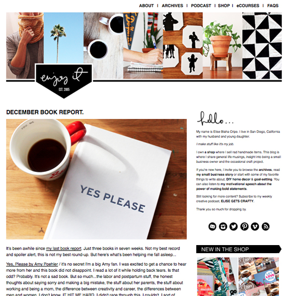
So welcome to the new ENJOY IT.

It's basically the same!

But cleaner!

Just in time for her 9th birthday next week!

I don't know about you, but whenever a blog I like announces a new design, my first thought (as a blogger) is "Oh no." because it always makes me feel like (as a blogger) I need to get my ducks in row and re-do my blog too. And then my second thought (as a blog reader) is "Oh no." because I always worry that (as I reader) I have to update my RSS feeds and re-figure out where the main content will appear.

I am pretty sure this makes me lazy. I am also pretty sure this makes me human.

Change is scary. So scary that I avoided it for 2.5 years. That's right. TWO AND A HALF YEARS ago I talked with Elsie and Emma about co-piloting a blog design course with them. I lamented about how small my blog photos were and we all agreed that I should totally increase my main content column size. Do you want to know why I didn't do this? Because I had 6.5 years of posts with photos that were resized for a 500 pixel wide column.

Guess what I have today? NINE YEARS of posts with photos that are resized for a 500 pixel wide column.

DAMN. I should have done it then. I totally should have done it then. But I didn't. Every few months I would think about it and every few months I would say, "Nahhhh." Until finally I was over that crap and it was seriously time for an upgrade.

So what's new?

Well, the banner, for starters. It's cleaner but still looks like me. I moved the navigation up a bit. I tightened up my about page. I adjusted my FAQ page a bit. I created an affiliate link heavy "Where did you get that?" page to answer the most frequent question I get asked.

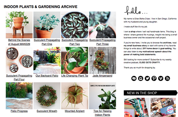
I also went cross-eyed reorangizing my archives. (I apologize for the pages that popped up in your RSS feeds. That was a total mistake.) You can see on the right sidebar that there is a link to both archives by date and archives by category. Clicking on the category link takes you to a page with almost all the topics I blog about. Clicking on those photos takes you to a unique archive page for that section.

Screen shot 2014-12-16 at 8.21.50 PM

For example, I now have a Yarn Projects page as well as a Sewing Projects page. I also divided up stuff like goal setting, small business and blogging, hopefully making it easier for you to find what you need. I also threw in an Indoor Plants and Gardening Archive because that seemed like the right thing to do.

I also cleaned the individual projects buttons off the sidebar. Now you can use the right sidebar to find a link to past projects and current projects (plus short descriptions of each).

I am highlighting some shop items on the sidebar since let's get real, this blog exists to promote the shop. I am also highlighting some popular posts (based on Pinterest) on the sidebar. I'm curious to see how these posts do.

Otherwise though, it's the same. Elise blogging about ALL THE THINGS. Heavy emphasis on timercam photos and spoiler alerts. A little more professional. A little more appropriate for my nearly 30 year old self. A little, "Hey! It's 2015 now and no longer 2007! Let's get fancy, but not confusing!"

I hope you'll continue to check in. And no need to update your RSS feeds.

EDIT : thanks for the "profile photo" thoughts. I have one on the way from my friend Cortnee and I'll see how that fits in on the top right. With the photo heavy banner I wasn't sure if it was necessary and it may not be but we'll see. I really appreciate your kind words and helpful suggestions. 🙂

Let me know if you catch any bugs or issues! I am on Mama duty today so it's unlikely I'll make updates, but Thursday I should be able to clean things up.
Posted in ,

69 responses to “A NEW LOOK FOR THE OLD BLOG”

  1. Lauren Pittenger Avatar

    It looks great. Congratulations!

    Like

  2. Brianna Avatar
    Brianna

    Love it, and you’re making me want to redo my blog, too. I’m sort of hating my blog right now.

    Like

  3. elise blaha cripe Avatar

    hey!
    I have posts that talk about the podcast all displayed under the small biz category. Are you referring to the Wednesday blog posts when I put the podcast note on the bottom? I don’t mark those as “podcast” because so often the topic is NOT about the podcast and that note is just a reminder for readers that they can check in for a new episode.
    But this page of my website elisejoy.com/podcast is updated with links to all the episodes and shownotes, if it would help.
    Let me know if that is NOT helpful and if there is something I can do to make it better.
    thanks!
    elise

    Like

  4. elise blaha cripe Avatar

    I ended up NOT using a banner through the theme builder and then coding the banner and the nav bar in the nav bar section of design > content.
    I have been emailing with typepad support though because I want to raise everything up a bit and they have some custom code you can drop into custom CSS that solves the problem (or hopefully it will, we’re working on it!) might be worth opening a help ticket! 🙂

    Like

  5. Jennifer Avatar
    Jennifer

    Lookin’ good!

    Like

  6. Laura Avatar

    The link to blogging tips on the archives by category page has 2 l’s [.htmll] 😉
    Just thought you’d like to know. I love your blog re-design and totally love the popular posts on your sidebar and archived pages!

    Like

  7. se7en Avatar

    This is fantastic, I love the look – I especially love how you have archived your categories, so that you can see images and you click on the images and you see more images from each post… I have been dying to do that forever. I tried making static pages for each category, but it is extremely labor intensive… Is there an easier way. Could you possibly share how you did that?

    Like

  8. Stephanie Howell Avatar

    Elise- You did a fantastic job. As always, I’m completely in awe of your drive and ability to just get.shit.done. And yes- add your pretty face back to the top immediately!!! xoxo

    Like

  9. Shaina Longstreet Avatar

    So glad I’m not the only one!! 😉

    Like

  10. Felicia Chia Avatar

    You’re absolutely right, it’s not a big deal at all! In fact, if you didn’t point that out, I wouldn’t even have noticed. I love your blog for the content, and am too hooked reading your words to notice the slight difference in photo width 😀 I’m sure it’s the same for other new and existing readers too 😉

    Like

  11. Colleen Avatar

    Hi there! We see that you opened a help ticket and you’ll hear back today! Thanks!

    Like

  12. Kristin Mara Avatar
    Kristin Mara

    Congrats, Elise! The redesign looks great and manages to still feel like your blog. Best of luck with all the resizing!

    Like

  13. chel Avatar

    I have to admit that I do most of my podcast listening and blog reading completely through my newsreader (on all devices), so I would LOVE LOVE LOVE it if your podcast page had a feed- or a way for my newsreader to know there was a new podcast added to the page.
    None of my readers (across devices) let me bookmark a non-feed page, so I have to keep marking the Wednesday posts as “unread” so I remember to go back and catch up on the new podcasts. That’s why I thought a category for the posts that reference the new podcast episodes might be a shortcut in lieu of a feed for the podcast page.
    This sounds a lot more complicated than I mean it to be (holiday planning has consumed my brain and ability to express myself in a coherent fashion…) so I apologize!

    Like

  14. elise blaha cripe Avatar

    well that’s an easy fix!! all podcasts have a feed… this is mine : http://elisejoy.libsyn.com/rss
    that should work, but let me know if it doesn’t. 🙂
    elise

    Like

  15. a touch of domesticity / katie sparrow Avatar

    If I was in my twenties or teens I’d say O.M.G. (with the Janice pauses) Elise! But as I’m in my thirties I’ll have to say Oh. My. Goodness. It really does look completely lovely and also completely like it should be, if you see what I mean. Everything you do is so purposeful and considered, organised and refined. And so it makes sense that your blog design is too! Gosh I do love a bit of categorised organisation. Big cheer! x

    Like

  16. young Avatar
    young

    Looks great! Love how the projects have their own page for easier browsing.

    Like

  17. Amy Avatar

    Beautiful!! Love your design style.

    Like

  18. Mirna R. Avatar
    Mirna R.

    I’ve been meaning to say this for a while (and now going through your 29 favorites post, I have the opportunity) but the design layout change has been amazing!

    Like

Leave a reply to Kristin Mara Cancel reply