enJOY it
an archived personal and craft blog from Elise Blaha Cripe.
-
Welcome to my holiday book updates! Hoping to share a few times in December, usually in the afternoons, in addition to other daily posting. I've eased up in a big way on my minibook making. They just don't excite me the way they used to. But I have started (and more importantly finished) holiday books for the past two years and I really love them. I am always so glad that I started this project (and relieved to finish) on December 26th.
You might remember I do not do anything daily for this album. I just add photos and stuff when we do something Christmas-y or I have something relevant to add. Sometimes this means four pages about our holiday cards. Sometimes this means a week goes by without me adding to the book. Super low pressure.
I use one of my 4×6 holiday minibooks. Love the mix of patterns, shape cards and cardstock (considering I choose them, it would be a major fail if I didn't). I never have a plan going in and I often move around the pages and patterns depending on what works and what I need to share my photos.
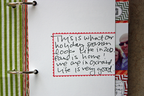
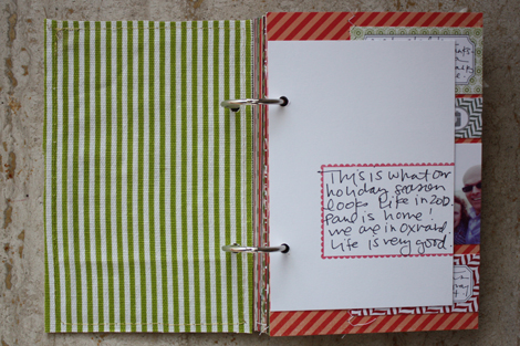
Here's the start of my book with relevant information about how I put the pages together below.
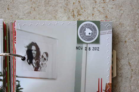
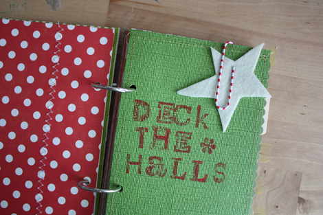
I used gold thread to machine stitch a piece of green and white fabric to the back of the chipboard cover. I love a pop of pattern on the inside, so this is a common addition for me. I also love machine stitching, so you'll see a lot of that throughout the album. The white card comes with the frame to act as a bit of a "title page." I always hand-write something sappy in there.
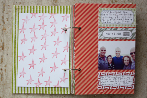
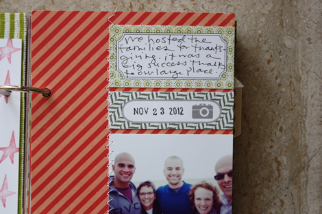
No photo for the beginning so I just stamped a star a few times on the backside of that white card. To the diagonal card I added a photo of the Blaha fam taken the day after Thanksgiving and some text in cute little Evalicious journaling spots.
I am sort of obsessed with the look of them all in a row like that. Added the white zig zag stitching to finish it off.
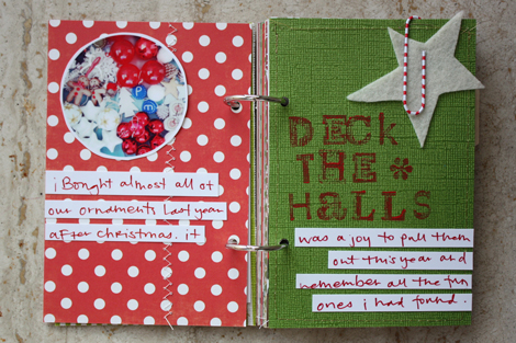
Handwritten journaling on strips of paper is a major go to for me. Too easy. I like that I can move them around and play with location and if I mess up, it's on the strips, not the book. Those letter stamps are from Target this summer. I used paint and not ink on them and the impression isn't super clear (that paper is textured) but it works. Used the paper clip that comes with the book to hold a felt star in place.
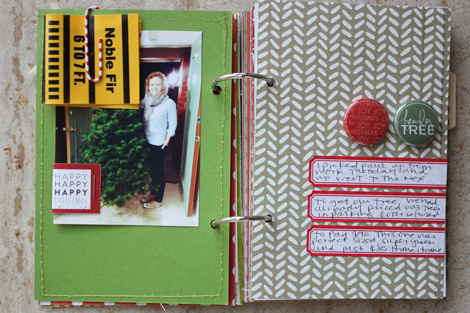
Obviously I do a lot of journaling on labels too. Those Martha Stewart & Avery labels (sold at Staples) were probably my best purchase of 2012. Love the folded tabs and badges (also from Evalicious) as simple embellishments.
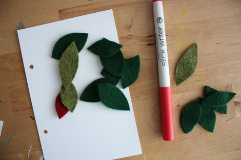
Pretty self explanatory. I glued down those small felt leaves and then just wrote on a diagonal. Sometimes I like my handwriting more on a diagonal than straight lines. Odd, but true.
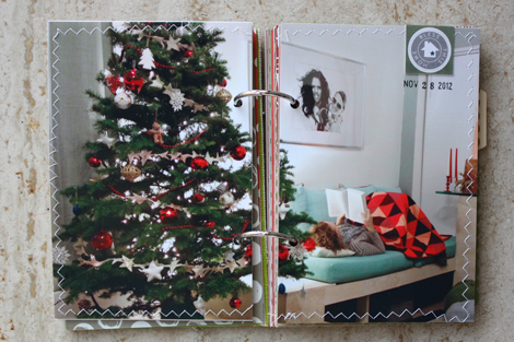
Annnnd, an 8×6 photo. You'll see me do this often in the album. Love the look of a big photo cut in half. I added the zig zag stitching around the whole thing to sort of bring it together. Love the tree. Love the quilt. Mostly love that framed photo of Paul.
That's it so far. Simple, simple, right? (If you have questions on how I construct minibooks like this, check this post. It's about summer books but the concept is the exact same and you'll find videos with relevant information.) I like to add a few pages at a time so the next update will probably be Thursday afternoon.
Supplies used : holiday mixed paper book, Evalicious embellishments, Martha Stewart & Avery labels, Office Depot date stamp, American Crafts red Slickwriter, Zig Millennium pen, Paper Source star stamp, ColorBox chalk ink, Target letter stamps.
-
Wrapping up my 2012 with one last set of monthly goals. (I am not sure how I'll be goal setting in next year.) This fall has been a bit odd for me, and it's been hard to come up with specific things to do. All I really want to do is enjoy this season. Enjoy that Paul is home to celebrate with me. Enjoy that I was busy enough and productive enough to hit my business & creative goals this year.
I want to spend a maximum of 15 minutes this month ordering gifts for family and then just chill. Cut down on the shopping. Cook more at home. Make time to visit with our friends in LA. Take more photos! Continue with the running. Evaluate how I want to use Project Life next year. Concentrate on what I want (and need) to focus on both professionally and personally in 2013.
December is going to fly. This I know. I'm excited.
ps. that ampersand sweater & check back this afternoon for my first holiday book update.
And please take a minute to visit my sponsors on the right sidebar. Thank you, as always, for supporting this blog.
-
Week 48 and I still love this project.
(click photo above to enlarge for a [somewhat] clearer image.)
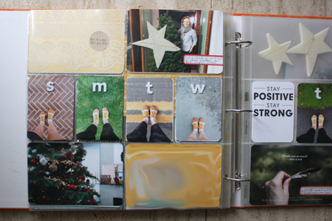
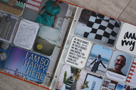
Some spreads, like this one, end up MUCH too "Elise Focused." This week, I blame the running shots and am going to work to do better to get more Paul into the album for the rest of December and of course in 2013.
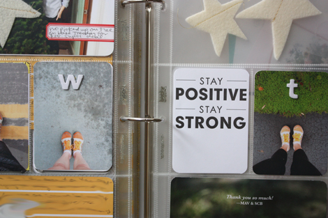
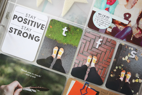
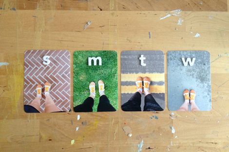
But, I decided to use my #mileaday photos because it was the first full week of running a mile each day. I love how they look like little trading cards. I just printed them 3×4 and added an American Crafts thicker with the day's letter on top. Seriously love this format even more that the instagram squares. I do not think I'll continue including them like this for the duration of the challenge, but it was fun this week.
Instead of a "traditional" quote card this week, I trimmed down a letterpress card from my girlfriend. It's still black and white and I loved the message (especially in reference to running).
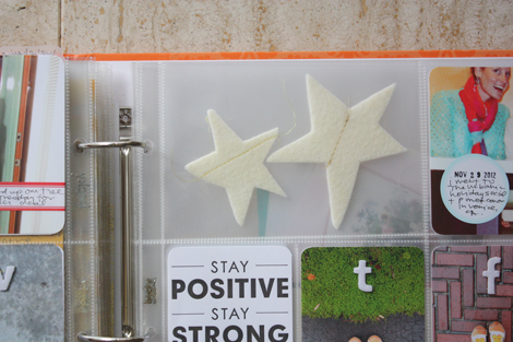
I added some extra felt stars from the tree garland to a pocket and will leave that pocket blank on the backside so they show through.
And that's it! Onward…
supplies / Paper Source
circle labels, Hambly patterned overlay, Office Depot date stamp & arrow paper clip, Amy Tangerine letter Thickers, Martha Stewart & Avery labels, Design A page protectors, I use a Fiskars corner rounder (it's not amazing, but it's lasted the longest of any corner rounder I've ever had). I am using a Zig Millennium 0.1 penand Recollections glossy marker throughout this album.
Confused by Project Life? Start here. Have a question about how I am tackling this project each week (including questions about the quotes & photo printing)? Check here. See all my Project Life posts here.
-
Week 47 and I still love this project.
(click photos above to enlarge for a [somewhat] clearer image.)
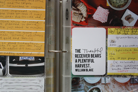
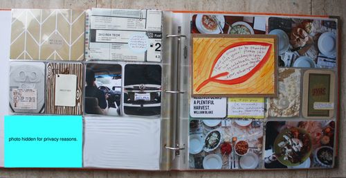
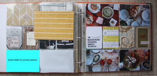
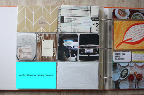
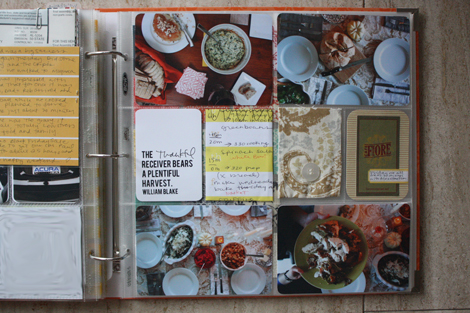
This is Thanksgiving week… I'm hoping to have this past week (week 48) up tomorrow. I was very random with photos this week so it's sort of all over the map. If anyone in the future wonders what sorts of foods we ate on Thanksgiving, this spread will clear it right up.
Aside from Thanksgiving, this week was a little random and the collection of photos and stuff is totally random too. Had to do some privacy blurring this week which is annoying, but sometimes necessary. Still love working in the Seafoam papers. 🙂
I included an extra Thanksgiving invitation into the spread with a 5×7 pocket page. I like how it just floats there. On the backside I added some handwritten journaling about our meal on top of another piece of Seafoam paper.
And yep, Thanksgiving photos fill the right side. Into the small pockets, I tucked our cooking to-do list, a scrap from the tablecloth packaging and a business card from the restaurant we went to on Friday night. No "This week" round-up card in the spread this week, it was pretty self-explanatory.
supplies / Paper Source
circle labels, Martha Stewart & Avery labels, Design A page protectors, soon to be released Seafoam patterned paper, Bebas quote font. I use a Fiskars corner rounder (it's not amazing, but it's lasted the longest of any corner rounder I've ever had). I am using a Zig Millennium 0.1 penand Recollections glossy marker throughout this album.
Confused by Project Life? Start here. Have a question about how I am tackling this project each week (including questions about the quotes & photo printing)? Check here. See all my Project Life posts here.
-
These weeks are flying.
I got started on my holiday book this week (for me the "Christmas" season starts when Thanksgiving ends) and I am excited to share full photos on the blog next week. I got our house decorated (which really means just a mantle, a new wreath and, of course, the tree). And perhaps most importantly, I stuck with #mileaday.
Paul and I are headed on a short road-trip today to say hello and good-bye to a friend of ours that is headed out on a work assignment for five months (not a deployment – but a government contract job, so close!). We have a lot of driving in our future, but in a new car, it's not quite as painful. I'm looking forward to a lot of chatter with Paul, a few great meals and a lot of time to think about what could be next.
Have a great weekend! Look for Project Life album updates Saturday and hopefully Sunday.
-
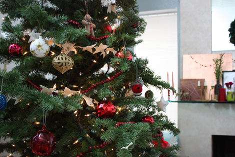
Our little place is starting to feel festive!
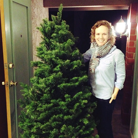
Hooray for buying trees on base where they can be taller than me, super green and… $35! After a parking lot tree guy wanted to charge
me $90, I was pretty pleased.I bought most of our ornaments on super sale last year after Christmas, and plan to do the same thing again this year. Then I think our collection will be pretty complete.
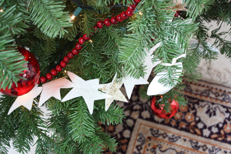
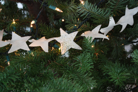
And my simple tree DIY ornament this year is a star garland.
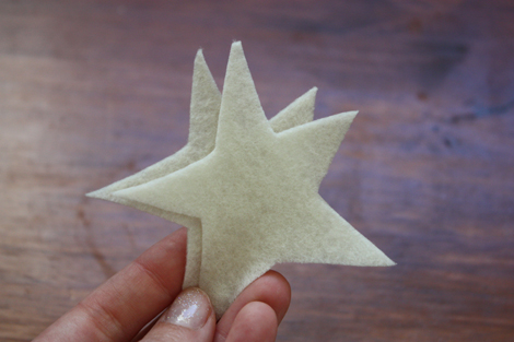
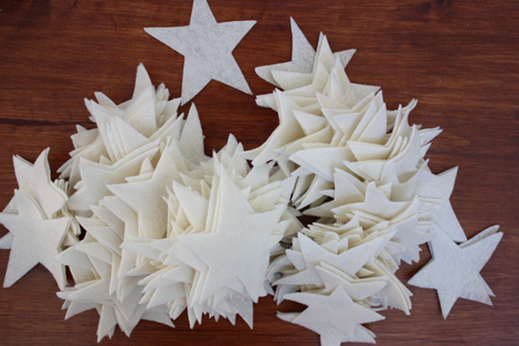
Last month, I cut a bunch of stars freehand out of cream felt.
Piles of stars.
And then I used my sewing machine and some gold thread to connect them all together. I added gold glitter to a few of them, but didn't love that (sort of a hassle and I don't think it adds much), but I love the star shape for sure.
Happy to be getting festive around here.
-
loving this e&p portrait painted by my Grandpa.
running a mile everyday and once again, appreciating the challenge.
enjoying seeing so many other people taking part in the #mileaday hashtag.
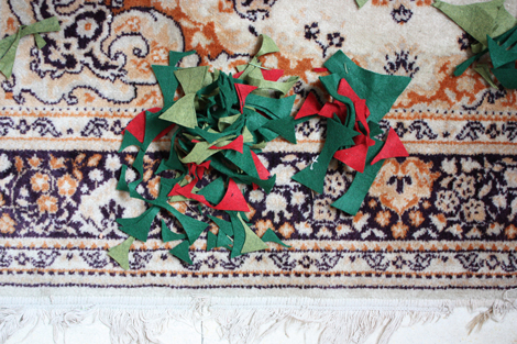
cutting oodles of green felt leaves for a Christmas wreath.
planning on getting our tree decorated today!
ordering photos for a project.
addressing envelopes for Christmas cards.
un-subscribing from all the store email blasts.
celebrating my 2500 blog post (this one!) & seven years of blogging next month.
clearing the fridge of Thanksgiving leftovers.
driving a new car (we love it – totally worth the year of research!)
buying on impulse an ampersand sweater.
trying to resist this hello sweatshirt.
listening to classical music on Pandora.
sewing the last of my four Christmas quilts.
appreciating hot coffee and good mail days.
looking forward…always looking forward.
-
see the first installment of the Seafoam Story here.
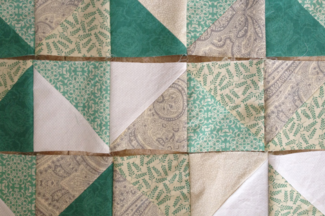
In many ways, I think the color story is the most important part of the kit (or of anything). The colors are what will draw people in first. If they like the colors, they will look closer to see if they like the patterns. Because of this, choosing and nailing down the colors was definitely the most stressful part of this whole adventure for me. They had to be perfect and it's hard to get perfect when you can't really see them in real life.
But in the beginning, I wasn't so worried about the exact shades. I was more focused on picking colors that made sense on their own and as a set. I wanted colors that would work with a variety of photos and not compete too much for attention.
To get ideas, I looked back through my first eight weeks of Project
Life. Since I had been mostly working without a kit and pulling
different papers and patterns together myself, this gave me a good idea
of what I liked to see in a Project Life album.The biggest colors that stuck out
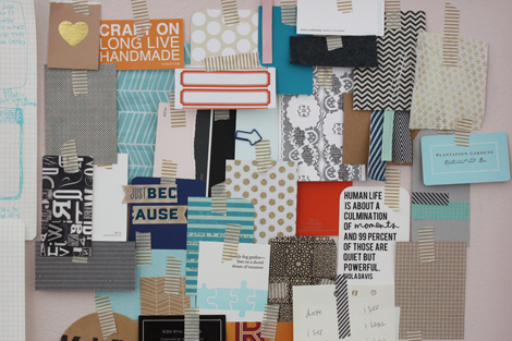
from those first few weeks were black, white, gray and teal. They were clearly my go-tos.And with those in the back of my mind, I looked through all the embellishments, fabrics and patterned papers I had in my house and pulled ones that
worked. I also went to the hardward store and pulled colors from their paint chip wall that jumped out at me. Seeing a bunch of different simple patterns and the color scheme
together really helped and also revealed what I already know (and have
already shared many times on the blog) I love two color patterns.Yep – I cannot get away from two color patterns (meaning one color with white). They are the papers,
fabrics and clothing pieces that I reach for over and over again.I sent Becky and Meredith (my Illustrator & design guru) photos of my inspiration board and they were both excited about where things were headed.
Meredith pulled together a color palette
and in the early days – that was the plan. Later, we ended up dropping
the pink, navy and light gray. Then we made that red-orange a bit more orange. Towards the very end, we dropped in a kraft and mustard yellow, both of which I cannot imagine the kit without now.Fun fact / in the early days, we thought gray would be
the focus color of the kit and started to play around with "gray"
titles. (Think "Slate" & "Gravel.") But as things progressed, the
light teal started to stick out as the main color. Becky thought of
"Seafoam" as a title and given that Paul and I are currently living on a
beach, I was totally sold. I LOVE the name so much and am happy it
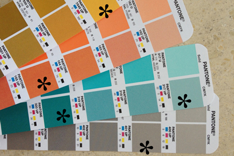
ended up fitting so well.The very final color step was working with Pantone books to pick exact shades that we could communicate to the printers.
It was important to me that the shades were a bit different than "classics" and that nothing came through to muddy. Or too gray. Or too bright. Or too bold. Or (obviously) too ugly. I felt a bit like Goldilocks at the end looking for something that was "just right" and more than once I cried to Paul that it was all going to be ruined because my "Seafoam" was too "Light Blue."
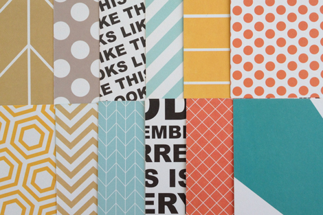
But we got it. And now that I have held the 12×12 papers in my hand (and used them in my album!) I am even more convinced that the colors, on their own and as a group work very well. WHEW.
…in the next installment patterns and text and bears, oh my!
-
see the first installment of the Seafoam Story here.
In many ways, I think the color story is the most important part of
the kit (or of anything). The colors are what will draw people in first.
If they like the colors, they will look closer to see if they like the
patterns. Because of this, the choosing and nailing down the colors was
definitely the most stressful part of this whole adventure for me. They
had to be perfect and it’s hard to get perfect when you can’t really see them in real life.But
in the beginning, I wasn’t so worried about the exact shades. I was
more focused on picking colors that made sense on their own and as a
set. I wanted colors that would work with a variety of photos and not
complete too much for attention.To get ideas, I looked back through my first eight weeks of Project
Life. Since I had been mostly working without a kit and pulling
different papers and patterns together myself, this gave me a good idea
of what I liked to see in a Project Life album.The biggest colors that stuck out
from those first few weeks were black, white, gray and teal. They were clearly my go-tos.And with those in the back of my mind, I looked through all the
embellishments, fabrics and patterned papers I had in my house and
pulled ones that
worked. I also went to the hardward store and pulled colors from their
paint chip wall that jumped out at me. Seeing a bunch of different
simple patterns and the color scheme
together really helped and also revealed what I already know (and have
already shared many times on the blog) I love two color patterns.Yep – I cannot get away from two color patterns (meaning one color with white). They are the papers,
fabrics and clothing pieces that I reach for over and over again.I sent Becky and Meredith (my Illustrator & design guru) photos of my inspiration board and they were both excited about where things were headed.
Meredith
pulled together a color palette
and in the early days – that was the plan. Later, we ended up dropping
the pink, navy and light gray. Then we made that red-orange a bit more
orange. Towards the very end, we dropped in a kraft and mustard yellow,
both of which I cannot imagine the kit without now.The very final step was working with Pantone books to pick exact shades that we could communicate to the printers.
It
was important to me that the shades were a bit different than
“classics” and that nothing came through to muddy. Or too gray. Or too
bright. Or too bold. Or (obviously) too ugly. I felt a bit like
Goldilocks at the end looking for something that was “just right” and
more than once I cried to Paul that it was all going to be ruined
because my “Seafoam” was too “Light Blue.”photo of 12x12s here.
But we got it.
And now that I have seen the 12×12 sample papers I am even more
convinced that the colors, on their own and as a group work very well. WHEW.…in the next installment patterns and text and bears, oh my!
