enJOY it

an archived personal and craft blog from Elise Blaha Cripe.

  • Here2 Here7 Here9
    Here3 Here4
    Here1 Here5 Here6 Here10

    Making lots of progress this week. Crossing stuff off my list like it's my job.

    I gotta be honest though, I am currently struggling to bring a better work / life balance into our normal weeks. The trouble with traveling on the weekends (when I usually put in a decent amount of computer time) is that I get totally "behind" and I feel like I could work from 8am-10pm every weekday. But Paul gets home at about 4:30 in the afternoon (great right?! almost makes up for that seven month deployment…) and ignoring him to sit at my computer seems pretty lame.

    I'm not yet sure of the solution (nor do I think there is a perfect one!). I have had some insanely awesome opportunities come forward this year and I am so excited to work at all of them. But, to be fair to what I have committed to and to myself, I am absolutely learning to let some things go. It's quite a challenge, as I have spent the last five years working hard to develop this job of mine (and most of that came from saying "yes!"). Now I just have to remember that I am working to live, not living to work.

    Deep thoughts for a Friday morning, no?

    Really, though, life is good. I'm thrilled & so grateful to be here and happy to recognize now, when things still feel manageable, that I have to be careful with my schedule and considerate of my time.

    Looking forward to throwing myself into this last workday & then enjoying a weekend at home.

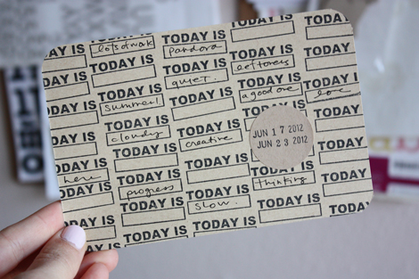
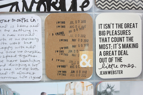
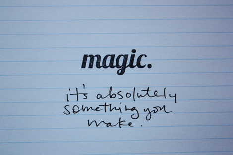
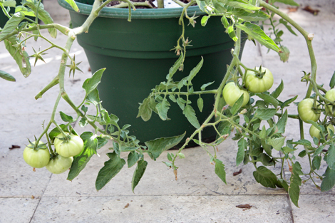
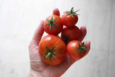
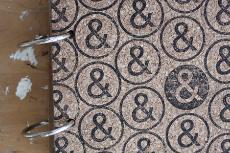
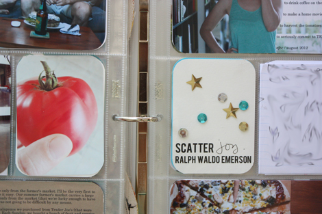
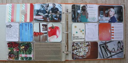
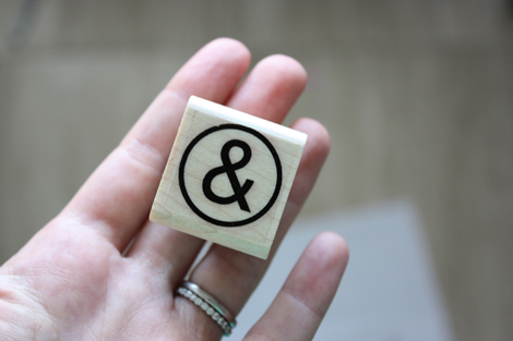
    *anticipating photo questions! The magic & ampersand stamps will be in the shop update – tentatively scheduled for September 10. That painting is the first stage of another attempt at "abstract". Once again, I am failing to make abstract look good. Paul and I were so thrilled to welcome a set of quintuplet tomatoes into our house last Wednesday. We are still picking out names.

  • Greener

    Alright. Remember last October when I shared my attempts to get my skin a bit more chemical free? I have stuck with it. And I would love to get all of my recommendations into one place.

    I want to note though… don't panic. I feel like transitioning to chemical free is super overwhelming. The good news is, you can take it slow and just replace products as you run out. You can also rest assured that once you have switched, buying products is much easier. Congratulations! You have less options! In a good way! No more standing in front of a wall of stuff wondering which one is the best. And the best news, perhaps, is that you can totally just skip this post and write me off as crazy!

    But this is what I'll say… chemical-free has been VERY good for my skin. Some of the products I have been purchasing cost more than I have spent in the past, but a little goes along way. And the deeper I get into this, the less product (both variety of and amount of each) I seem to need.

    Skin

    click to enlarge.

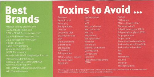
    I shared this cheat sheet in my first post, but here it is again. It's from There's Lead in My Lipstick and I still carry it around in my wallet and check products against it. Please note, not everything I am sharing here today is perfect; a few items contain fragrance which is considered a no-no because it's not regulated. I have starred any product that has at least one ingredient on the chart. All of these products, though, have been a step in the right direction for me because they are paraben free.

    Skincareeveryday

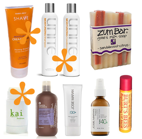
    For the morning : Trader Joe's shaving lotion, Unite shampoo, Unite Conditioner, Zum Bar body soap, Kai deodorant, Pangea Organics body lotion, Josie Maran body sunscreen, Josie Maran facial sunscreen, Burt's Bees Pomegranate lip balm.

    There are a few stars on this section for obscure long named chemicals, but I am pretty happy with everything here. I was very nervous to swap out my deodorant and then I made an impulse purchase and blew it. I saw that it was paraben and aluminium free (and smelled amazing) so I bought it despite the ridiculous price tag. Then later realized it does have a few toxins from the no list. The good news is it works great and it has much fewer chemicals than the Dove deodorant I've been using for years. Once this one runs out, I'll be trying the Lavanila Healthy Deodorant.

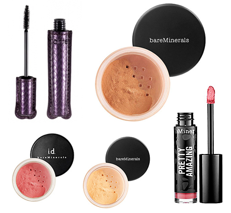
    Skincaremakeup

    For when I wear make-up : Tarte mascara, bareMinerals bronzer, bareMinerals blush, bareMinerals well rested, bareMinerals Pretty Amazing lip color in "courage."

    I really don't wear make-up that often and when I do it's usually it's just sunscreen, a bit of bronzer, under eye powder and Tarte mascara. If I am going to something fancy, I'll add normal face powder, a bit of blush, eye stuff and lip stuff. But that's rare, folks, and my application is somewhat tragic so it's probably useless anyways. Seriously though, that mascara is fantastic. Just that and Josie Maran sunscreen and you're well equipped for life, I think.

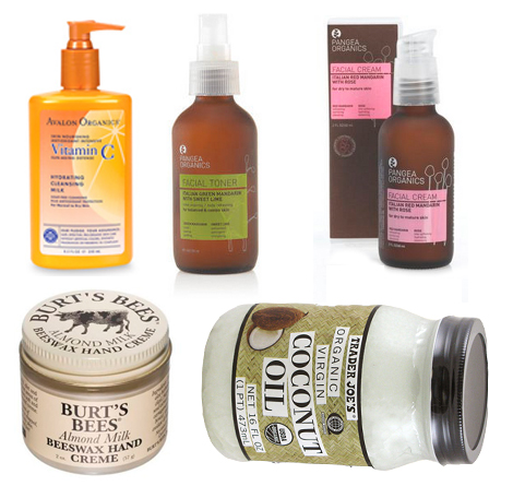
    Skincarenight

    For the evening : Avalon Organics Vitamin C cleansing milk, Pangea Organics toner, Pangea Organics face lotion, Burt's Bees almond lotion, Trader Joe's organic coconut oil.

    I joke to Paul that my nighttime routine involves about 15 steps (thankfully my morning rountine is super quick). My favorite part is spriting the toner. I am obsessed with the smell. The face lotion is great too. Lately, I have been trying to save my feet from complete a summer/running breakdown and so I apply a heavy coat of either Burt's Bee's almond lotion or coconut oil (on the suggestion of my friend Jessica) right before hopping into bed. I have noticed great improvement on my dry skin, but I am sure that's more from diligent application than chemical-free product.

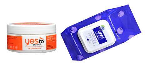
    Skincaretravel

    For when I am traveling : yes to carrots body butter, yes to blueberries facial tissue + small bottles of my shampoo & conditioner.

    When we take long or short vacations, I am all about keeping it simple. Love those facial tissues, but don't love the waste that would come with daily use. I use them just on trips because they are super easy to pack and include a wash, toner and moisturizer all in one. That body butter is great and not too greasy.

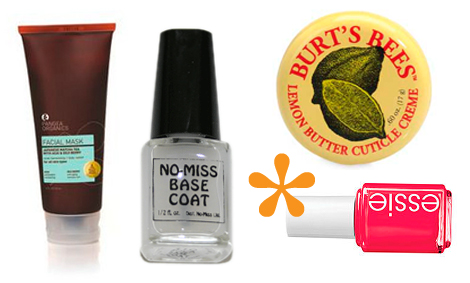
    Weeklyskincare

    For about once a week : Pangea Organics face mask, no-miss base coat, Bert's Bee's cuticle cream, Essie's ole caliente nail polish.

    This mask is amazing. When I remember, I wash my face, apply it, let it sit for about 15 minutes then rise it off and use toner and face lotion as usual. I love how it makes my skin feel, and again, a little goes along way with this stuff. I have sort of given up my search for fantastic nail polish colors that don't peel off or chip (I have found some that don't chip but they don't come in awesome colors and some in awesome colors that peel). I fully believe they are out there, but right now, Essie's ole caliente is my favorite. I like to think I am helping my cause by applying a no-miss base coat on top and bottom but who knows if that's legit or not.

    It should go without saying, but I am not an expert on this and I can't guarantee what will be the best product for you or your skin! I just like to share what I find. Any chemical-free favorites you'd like to share? You guys always have fantastic ideas about this stuff and I learn so much from the comments.

    *some links used are affiliate links.

  • Rubberstamps

    I thought it would be fun (and helpful!) to write a post sharing my rubber stamp tips & tricks. I get a decent amount of questions about stamps & ink, and while I am far from an expert, I have some thoughts to share.

    First, stamping is a craft category entirely on it's own, complete with websites and message boards. People make amazing things with stamps, ink, embossing powder, chalk, pens, glitter, the works. But for me, stamps are just something that I use to quickly enhance paper projects and cards I mail to friends. My tools and techniques are pretty simple.

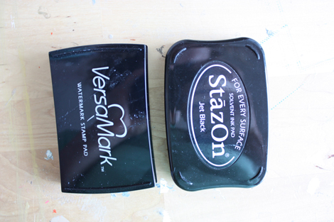
    I basically use two types of ink.
    Stampsink

    VersaMark & Jet Black StazOn. There are hundreds of other brands in thousands of other colors, but at the end of the day, my desert island craft box (what, you don't have one packed and ready to go?!?) would include just those two. They are versatile & simple to use.
    Stampsample3Plwk16detail3
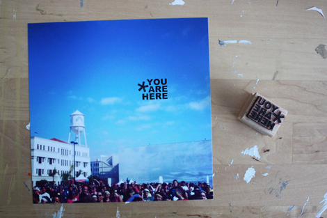
    stamps : my own & an Office Depot date stamp.

    I use black StazOn on my personal projects all the time – like 97% of the time. Why? It's super quick drying and sticks to glossy photos. I use a date stamp on almost every Project Life photo and black StazOn gives me a dark & clear impression and doesn't take an hour (or more!) to dry. I can slide it right into my album after a few seconds. I also like pens that will write well and dry quickly on a glossy surface and often use an American Crafts slickwriter or a Zig Millennium pen.
    Stampsback
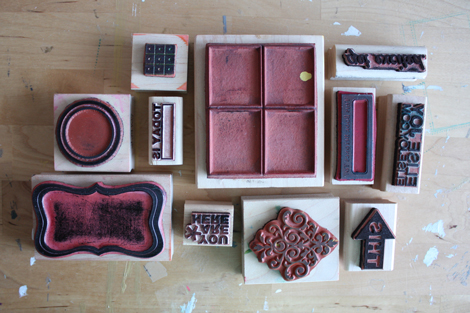
    stamps above are all my own or Paper Source except that four quadrant that says "Northwoods Rubber Stamps Inc" on the side.

    Two things to note about StazOn: First, it STAYS ON your rubber stamps. This is what my stamps look like on the backside. Stained black. I know this has got to drive some folks crazy, but for me, it isn't a big deal, because like I said, 97% off the time I am using black. If I need to change colors, I clean the stamp (not after I use black but before I need to use a new color.)
    Stampcleaner

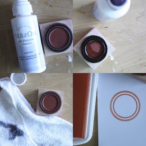
    There is a special cleaner for StazOn that will remove the ink. You rub it on the rubber, let it sit a bit and then wipe it clean with a cloth. The photos above show this in action. I removed black (which had probably sat on that stamp for at least two years) and then stamped it in orange. Unfortunately you can't really tell in the above photo, but after using the cleaner, I got a pretty great orange with ColorBox chalk, the other brand I sometimes use because it's quick drying too.

    The second thing is that StazOn, like many other ink brands, is super "juicy" when you first get it. This matters because if you are not expecting it, you may "over ink" your stamp by pushing it too hard into the pad. I always recommend taking a few practice stamps on scratch paper before diving into an important project to get a feel for a new inkpad (especially with stamps like date stamps that have small details).
    Stampheart
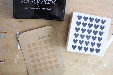
    Paper Source hearts pattern stamp

    And VersaMark! I love VersaMark for two reasons. One, it makes a beautiful water mark impression. So if I want something subtle on cardstock, VersaMark is great. Second, it's sticky so works really well with embossing powder.
    Stampssamples

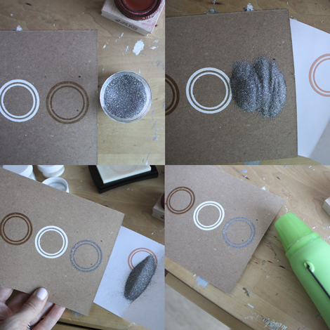
    Embossing powder is a very fine powder that collects where the surface is sticky (in this case the stamp impression). Once the excess powder is poured off, you heat the impression with a heat gun and the powder melts to reveal a raised and glossy look.

    Stampsexamples
    Paper Source clear, white & silver glitter embossing powders.

    Embossing powder comes in hundreds of colors, but I most frequently use clear, white and metallic. (Embossing powder is how I get the cover art to appear white on the kraft covers for my minibooks.)

    Stampssimple
    stamp : coming soon to my shop.

    No secret here, but I love super simple stamps. Shapes and frames are great. Simple words and phrases that I don't get tired of are great. Stamps are like clothing in that the cost per wear goes down each time you use them. If you can only think of one time you'll wear it (or use it) it's probably not an item you should buy (unless we're talking wedding dress or a stamp you'll use on your invites).

    As for techniques, I do the same things two over and over in my projects.

    Stamprepeat
    Stamprepeat2
    Stamprepeat3
    stamps shown above : Paper Source, my own (returning to the shop soon) & a SMASH date stamp.

    First, I repeat the same stamp and fill the space completely (usually taking care to go off the edge of the paper). The right stamp can easily turn into a background pattern that's unique and graphic.
    Ps1 Label1
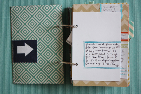
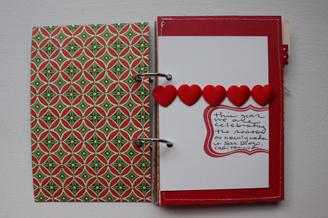
    my own frame design for minibooks & Paper Source bracket stamp. blue ink is StazOn in teal. red is ColorBox Chalk.

    Second, I stamp frames off the edge of the paper or card. It's just a personal preference, but like wrapped labels, I think a stamped frame looks better with one edge cut off. Stamps (especially frames) make killer journaling spots.

    Hope that helps a bit – please let me know if you have more questions! It has been so fun to get back into stamping a little bit this summer after the launch of my first set of stamps. My goal, of course, is to create stamps that you (and I!) am excited to work with and are super versatile. I am so looking forward to the next launch.

    ps : I have so many Paper Source rubber stamps because I worked there for 2.5 years. This is NOT a sponsored post, but many links used throughout are affiliate links. That cute "hubbie" stamp in the top photo is c/o Amanda Rose's Stamp Shop. My wooden stamp display in the top photo is from Pottery Barn.

    Other posts you might enjoy:


  • Instalove

    Like everyone else, I am still Instagramming my life away. Above are some favorites from the past month or so and below are some "tips" and my favorite filters.

    one : pick a bonus focus. I share everything, but I love having a few hashtags to rely on to get my camera out and keep me thinking. #patternaday is still going almost daily. And it's less prolific best friend #textaday gets used about twice a week.
    two : use TimerCam. I'm obsessed with this simple app that gives my iPhone a five second self timer. Awesome for fun angles and hand shots.

    three : amaro & valencia are my favorite filters and 99% of the time are my go-tos. I never use frames because without them, the photos have more versatility later when I pull them onto the blog or into Project Life.

  • Wedding
    Wedding7
    Wedding2
    Wedding8
    Wedding6
    Wedding3
    Wedding10
    Wedding4 Wedding11
    Wedding9

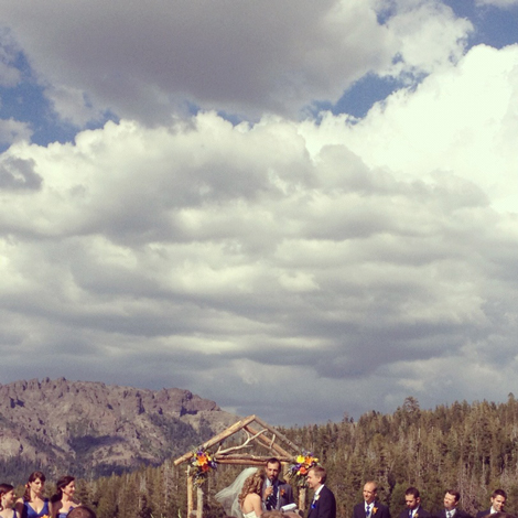
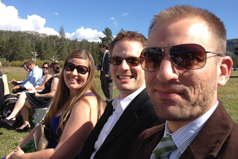
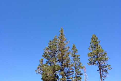
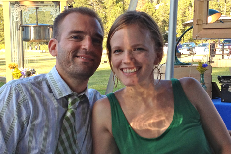
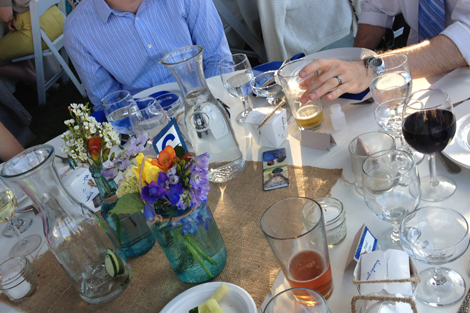
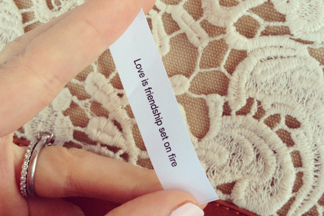
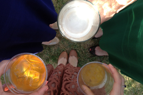
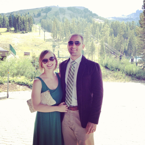
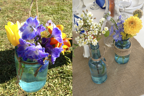
    We were up in Kirkwood (near Tahoe!) this past weekend for the wedding of one of Paul's college friends. It was stunningly beautiful. Weddings are always amazing, but for this one they did such a wonderful job on the details. Fortune cookies with custom sayings? Blue mason jars? The wooden arch? THAT SKY?!?

    Loved it. I love love. Two more weddings to go in our Summer 2012 Marriage Marathon. Check plus.

    ps. my earrings and dress. sadly, I don't have a source for that clutch.

  • Bbqchicken
    Bbqchicken2

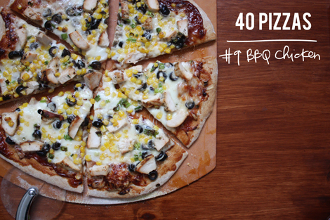
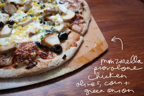
    pizza no. 9 : bbq chicken.

    occasion : it's Wednesday.

    crust : our whole wheat usual.

    sauce : bbq sauce.

    cheese : mozzarella & provolone.

    toppings : black olives, green onion, chicken & corn.

    thoughts : this is our go-to and has been for years. Wednesday, we realized we didn't have the ingredients for the pizza we planned on making and I had to check the blog to be sure I hadn't shared this BBQ pizza before. SO, so easy because you don't have to make sauce, just squeeze it out of the container onto the rolled out dough. Add corn (fresh or defrosted frozen) & whatever else and you'll have a great pizza.

  • Plwk31

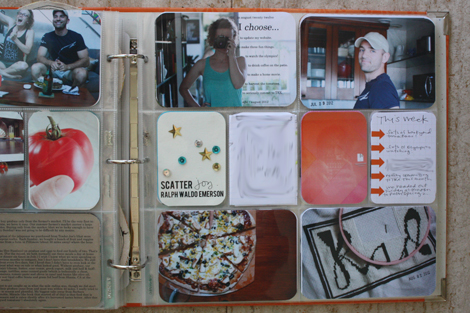
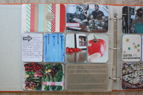
    Week 31 and I still love this project.

    Plwk31full

    (click to enlarge & the image above will be [somewhat] clearer)

    Playing some catch up here! As mentioned on Wednesday, I turned our weekend trip to Palm Springs into its own spread and week 31 actually only documents Sunday-Friday.

    Plwk31right

    Like so many of my spreads this summer, this week is pretty basic. It's really just a lot of photos over and over again. (And again.) The key to long term success for me with this project seems to be sticking to the basics and then getting creative with it when I am in the mood.

    Plwk31left

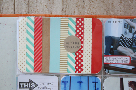
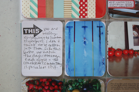
    This week so much of our time went to watching the Olympics.

    Plwk31detail3

    As a nod to that, I used red, white & blue (and gold) washi tape to decorate my date card. Very simple, I just wrapped different strips around white cardstock. The majority of the tape here is c/o Freckled Fawn. Freckled Fawn has generously offered a promo code for me to share with you – use "enjoyit" for FREE SHIPPING on all orders over $10 through 8/15.

    Plwk31detail

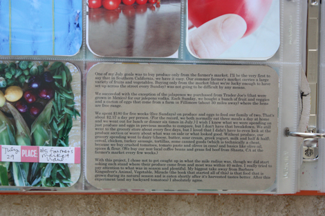
    Each week in July I included a photo of our farmer's market produce. This week marked the end of my "goal" to eat local for the month & so in addition to the photo, I included a lot of the text from my post on the topic. I am going to continue taking photos of our weekly haul, but I think instead of including them each week, I'll save them and do a big grid page later this fall.

    Plwk31detail2

    Simple, simple, wins the race.

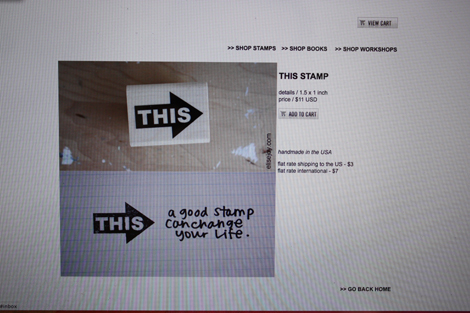
    supplies / Paper Source circle label, Martha Stewart & Avery labels, Freckled Fawn washi tape (free shipping on orders over $10 with promo code "enjoyit", Elle's Studio date tab, Elise Joy THIS stamp, Design A page protectors (which are available in this variety pack),  Clementine core kit, Bebas quote font. I use a Fiskars corner rounder (it's not amazing, but it's lasted the longest of any corner rounder I've ever had). I am using a Zig Millennium 0.1 pen and Recollections glossy marker throughout this album.

    Confused by Project Life? Start here. Have a question about how I am tackling this project each week (including questions about the quotes)? Check here. See all my Project Life posts here.

  • Here8
    Here4
    Here7
    Here11
    Here9
    Here3
    Here14
    Here5
    Here10

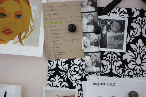
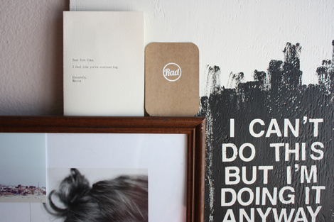
    Sometimes, I take photos throughout the week and then have a healthy assortment to share here on Fridays. Other times, I take all my photos around the house on Thursday afternoon in a few minutes. This week, I took them over a few hours in my office on Wednesday. They absolutely were not supposed to be "themed" but when I was starring ones to use, I realized it was inadvertently going to be a LIST WEEK (like SHARK WEEK, but drier) around here.

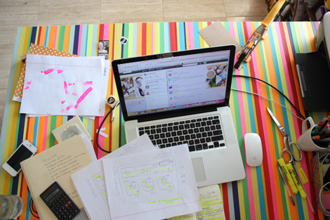
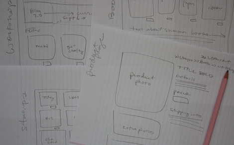
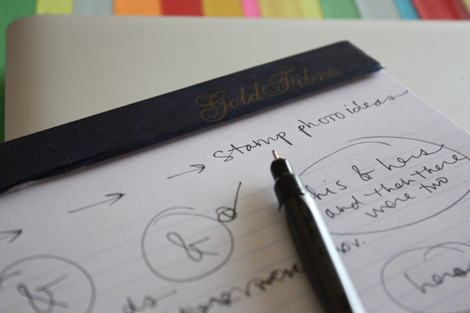
    I've got lists all over the place. Daily to do lists, obviously, but also: lists of materials to finish (15 to go!). Lists of priorities for the next few months. Lists of general business goals for this fall. Lists of photos to take. Lists of web pages still to design. And the sketches… oh the sketches. I'm sketching stamp photo ideas. I'm sketching new business card concepts. I'm sketching out web pages. The way my brain works, I have to grid and table out each screen with pencil before I can begin to conceptualize it in Dreamweaver (the web design program I use).

    I absolutely love every bit of the web design process. Which is hilarious when I remember learning web design in college. (I took two semesters.) I recently found these two posts (#1 from November 2006 & #2 from March 2007) from when I was pulling my hair out (and loving the photobooth app). Working for a grade and having to do all sorts of technical crap was NOT my idea of a good time, but thankfully, I hung in there. I am so grateful to Elise from five years ago. It's seriously magic when the page pops up exactly how you want it to look.

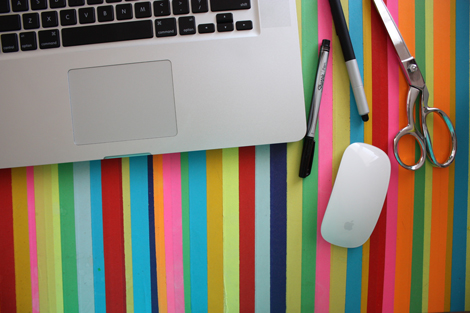
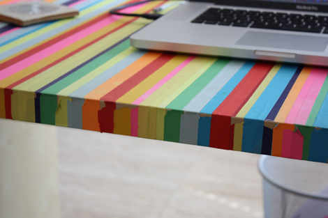
    RANDOM BUT IMPORTANT! I've been getting questions about how my taped desk is holding up. The photos above should give you an answer. Basically, the top still looks pretty decent. The side where I sit is a peeling mess. But overall I'd give it a 9.5. Or if you prefer the new gymnastics scoring, it's a solid 16.401 [insert green triangle here]. I'd highly recommend this simple DIY to fancy up a workspace.

    Have a good one.

  • Radframed

    27MATERIALSthread

    Radthread3

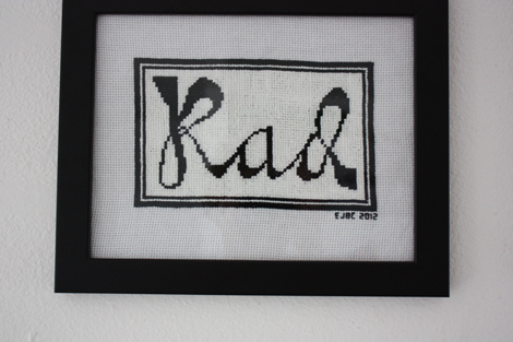
    Technically, I guess this is an "embroidery floss" project and not thread. But the good news is I'm the judge and I call fair ball. This adventure is about pushing my own boundaries and trying different craft projects, NOT about getting docked for technical merit. 😉

    Radinitials

    So far, this project has taken me the longest to finish of all the materials. Something that I really enjoy about longer term projects is how when I think about making them, I can remember exactly what was going on in my life and what I was watching on TV as I worked. My first quilt was when I really started watching Arrested Development on a loop. My second quilt was when I got hooked on Friday Night Lights shortly after Paul left last fall. My knit blanket was that last looong month waiting for Paul to get home when I raced through six seasons of How I Met Your Mother. And this piece will always remind me of the summer 2012 Olympics. I measure the passing of time in television and craft projects, clearly.

    Radfull

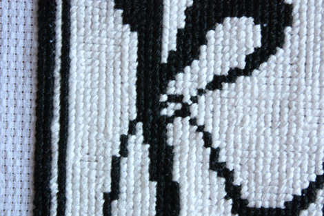
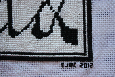
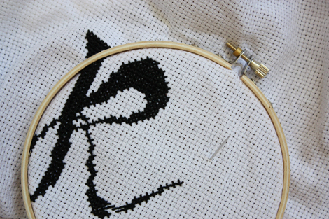
    This is a true "Elise project" too. Black and white, fairly simple, and more than a few errors. Cross-stitch is not tricky, but it is hard to get perfect. You amazing cross-stitchers out there would be terrified if you saw the tangled mess that is the back of my fabric. I sent a photo to my mom (who's neat backs would win gold medals) and she laughed out loud.

    Progress1

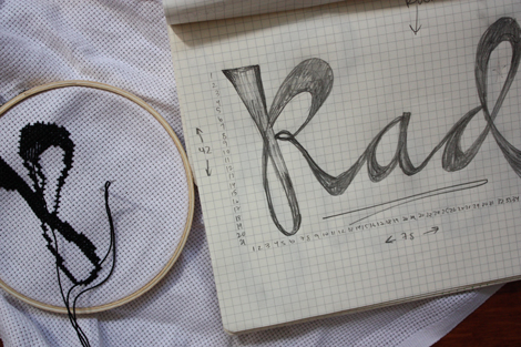
    There are many super simple tutorials online for how to cross-stitch. You can absolutely purchase cross-stitch patterns. I am sure you can purchase letter patterns. And in fact, there is probably an app for making your own patterns. But I just sketched my basic plan on graph paper and then dove in with black.

    Progress2

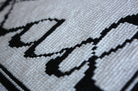
    When I stand back, there are definitely points on the letters that I would prefer thicker or thinner, but overall, I am happy with it. I added the black border once I had them done and then made the choice to fill in the whole thing with white. (I contemplated a color at first but thankfully remembered only black and white stands the test of time around here.) It took forever (two weeks) to fill in and was so boring compared to the interesting letter design. But it works and makes the letters seem more significant I think.

    Radthread2

    So, thread! Rad! I'm calling you complete.

    Dottedline

    This is project 12 of 27. I am attempting to complete 27 craft projects using 27 different materials before I turn 28 on 02.22.13. You can follow my progress here on the blog or on pinterest. Birthday challenges are my favorite. You can see the 26 Projects I completed while 26 here and the 27 materials I have used so far here.

  • Projectlifepalmsprings

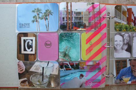
    I decided to give our weekend trip to Palm Springs it's own full spread in our (my?) Project Life album. I definitely did not take as many photos on this mini getaway as I did last time, so I didn't have enough to justify a full minibook. But, happily, I did have some fun ones that I wanted to highlight and I figured it would be cool to do something different and complete a full spread from one trip. I'll be sharing week 31 (the week before we left) this Sunday as usual.

    Palmspringsfull

    (click to enlarge and the image above will be [somewhat] clearer.)

    Detail1

    There are three fun things I want to highlight as I share this spread…

    Cut

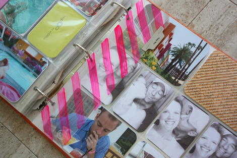
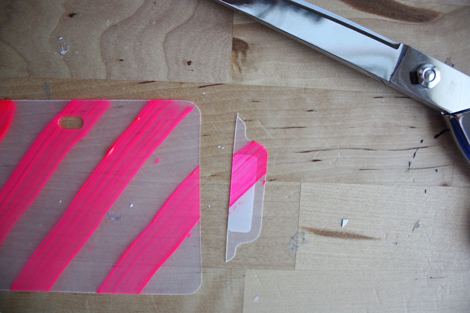
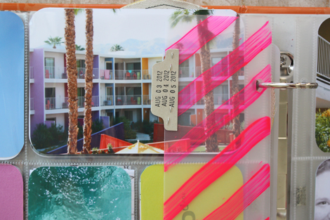
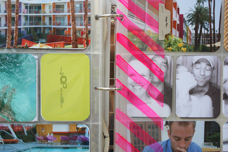
    First, I wanted something "extra" marking these pages, but I wasn't sure what that could be. I didn't have a lot to say, so I didn't need a journaling insert other than what's on the 4×6 diagonal lined card. After thinking for a bit, I decided to add a Project Life divider. But for extra punch, I painted hot pink stripes on it. Because I didn't really want the extra tab sticking out the top of the album, I snipped that right off. I used fabric paint because that was the best neon I had on hand. It stuck really well to the acrylic divider.

    Happyplace

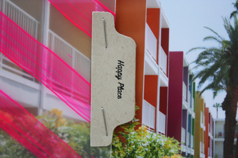
    Instead of the top tab, I stapled one to the side with "happy place" (from the SMASH date stamp) stamped on top…

    Tabdates

    …and Friday, Saturday & Sunday's dates on the back.

    Palmspringsright

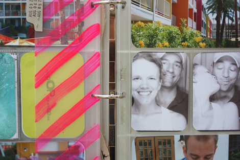
    I love that it adds decoration, but is see-through so the photo stay the focus.

    4photos

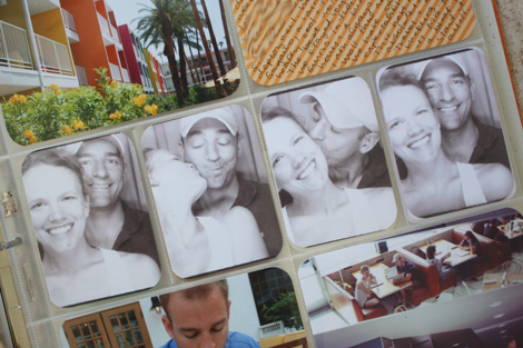
    The second thing involves the photos. I obviously had a bunch of colorful ones from the trip, but I didn't have many of the two of us. I really wanted to include our photobooth strip, but it's so tiny that I feared it would get lost on the page (plus I want to frame the original).

    Photobooths

    My solution was to scan it into my computer (at super high resolution) and then crop each frame to 3×4 and print. I love how the four photos look in a row (even though 1 and 4 are very similar) and the black and white actually works well against all the color. I will absolutely be using this technique again (and again) as we find more photobooths to hop into.

    Palmspringsleft

    And third, you might have noticed on the left side, there are two sneak peeks of NEW stamps.

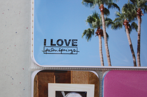
    Stamppeek1

    My new I LOVE stamp might be the most versatile yet.

    Stamppeek2

    And the new "RAD" stamp may be the least. 😉 But I love it – especially here in gold embossing powder on pink paper. I will be sharing more stamp peeks over the coming weeks and of course I will let you know when exactly to expect that big shop update.

    Lastone

    Super fun. Rainbows for the win.

    p.s. I have been holding on to that "you pop my wheelie" greeting card for YEARS. This spread was the perfect opportunity to use it in all it's neon glory.

    supplies / neon pink fabric paint, SMASH date stamp, Echo Park patterned paper, Ormolu kraft tab, Elise Joy stamps coming soon!, Project Life scrapbook dividers, Design A page protectors (which are available in this variety pack), Stazon ink, I use a Fiskars corner rounder (it's not amazing, but it's lasted the longest of any corner rounder I've ever had). I am using a Zig Millennium 0.1 pen and Recollections glossy marker throughout this album.

    Confused by Project Life? Start here. Have a question about how I am tackling this project each week (including questions about the quotes)? Check here. See all my Project Life posts here.