see the first installment of the Seafoam Story here.
In many ways, I think the color story is the most important part of
the kit (or of anything). The colors are what will draw people in first.
If they like the colors, they will look closer to see if they like the
patterns. Because of this, the choosing and nailing down the colors was
definitely the most stressful part of this whole adventure for me. They
had to be perfect and it’s hard to get perfect when you can’t really see them in real life.
But
in the beginning, I wasn’t so worried about the exact shades. I was
more focused on picking colors that made sense on their own and as a
set. I wanted colors that would work with a variety of photos and not
complete too much for attention.
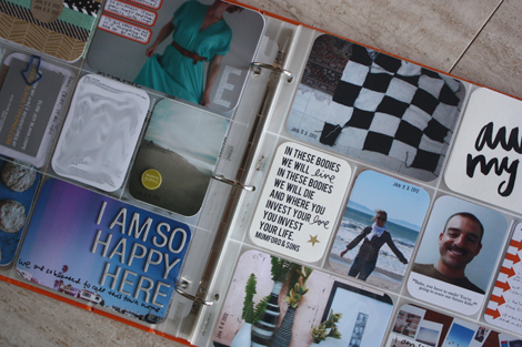
To get ideas, I looked back through my first eight weeks of Project
Life. Since I had been mostly working without a kit and pulling
different papers and patterns together myself, this gave me a good idea
of what I liked to see in a Project Life album.
The biggest colors that stuck out
from those first few weeks were black, white, gray and teal. They were clearly my go-tos.
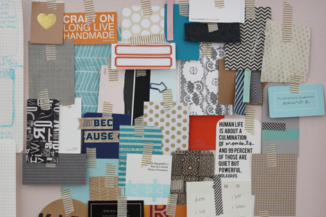
And with those in the back of my mind, I looked through all the
embellishments, fabrics and patterned papers I had in my house and
pulled ones that
worked. I also went to the hardward store and pulled colors from their
paint chip wall that jumped out at me. Seeing a bunch of different
simple patterns and the color scheme
together really helped and also revealed what I already know (and have
already shared many times on the blog) I love two color patterns.
Yep – I cannot get away from two color patterns (meaning one color with white). They are the papers,
fabrics and clothing pieces that I reach for over and over again.
I sent Becky and Meredith (my Illustrator & design guru) photos of my inspiration board and they were both excited about where things were headed.
Meredith
pulled together a color palette
and in the early days – that was the plan. Later, we ended up dropping
the pink, navy and light gray. Then we made that red-orange a bit more
orange. Towards the very end, we dropped in a kraft and mustard yellow,
both of which I cannot imagine the kit without now.
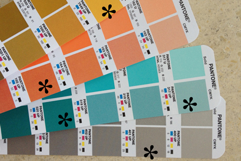
The very final step was working with Pantone books to pick exact shades that we could communicate to the printers.
It
was important to me that the shades were a bit different than
“classics” and that nothing came through to muddy. Or too gray. Or too
bright. Or too bold. Or (obviously) too ugly. I felt a bit like
Goldilocks at the end looking for something that was “just right” and
more than once I cried to Paul that it was all going to be ruined
because my “Seafoam” was too “Light Blue.”
photo of 12x12s here.
But we got it.
And now that I have seen the 12×12 sample papers I am even more
convinced that the colors, on their own and as a group work very well. WHEW.
…in the next installment patterns and text and bears, oh my!


